Mind, Body, Spirit.
Strength, Flexibility, Endurance.
Faith, Hope, Love.
We like to think in threes. Sometimes we want our Mind, our Body, and our Spirit to be in balance; sometimes we just want to assert how something stands. As it happens, I had a bike wreck two weeks ago; right now, my Body is weaker than my Mind.
These concepts imply that the balance or imbalance within the triad is somehow interesting and worth communicating, as in the old joke:
Better, Cheaper, Faster: Pick Two.
It would be nice to be extremely strong, fabulously flexible, and have everlasting endurance; but it is not absolute ability that determines what an athlete should focus on. If they seek balance (shot putters and marathoners might not), then it is the relative relation between these attributes that matters. A widget — a visual representation that you can interact with — that let you express this relation would therefore be useful.
A Triangular Diagram for Triad Relationships
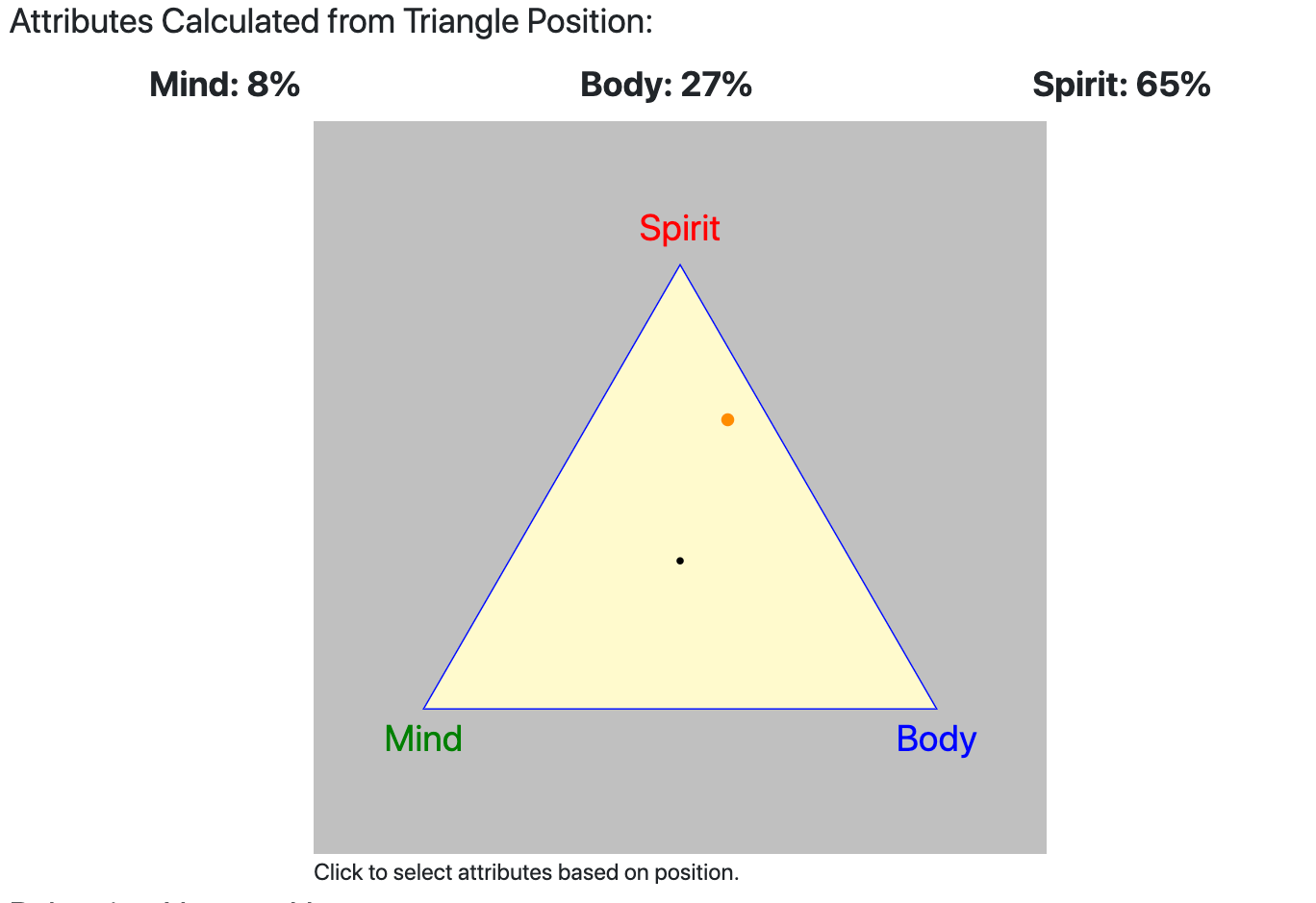
You can do this on a white board by drawing a triangle, and placing a dot somewhere on the triangle, as in the opening image.
But if you want to record this information, or compare two different balances, it would be helpful to have each position on the triangle turn into numbers, so that we can save it in a database or write an algorithm against it. The dot below represents more Spirit than Body, and only a little Mind, because it is closer to the point labeled Spirit:

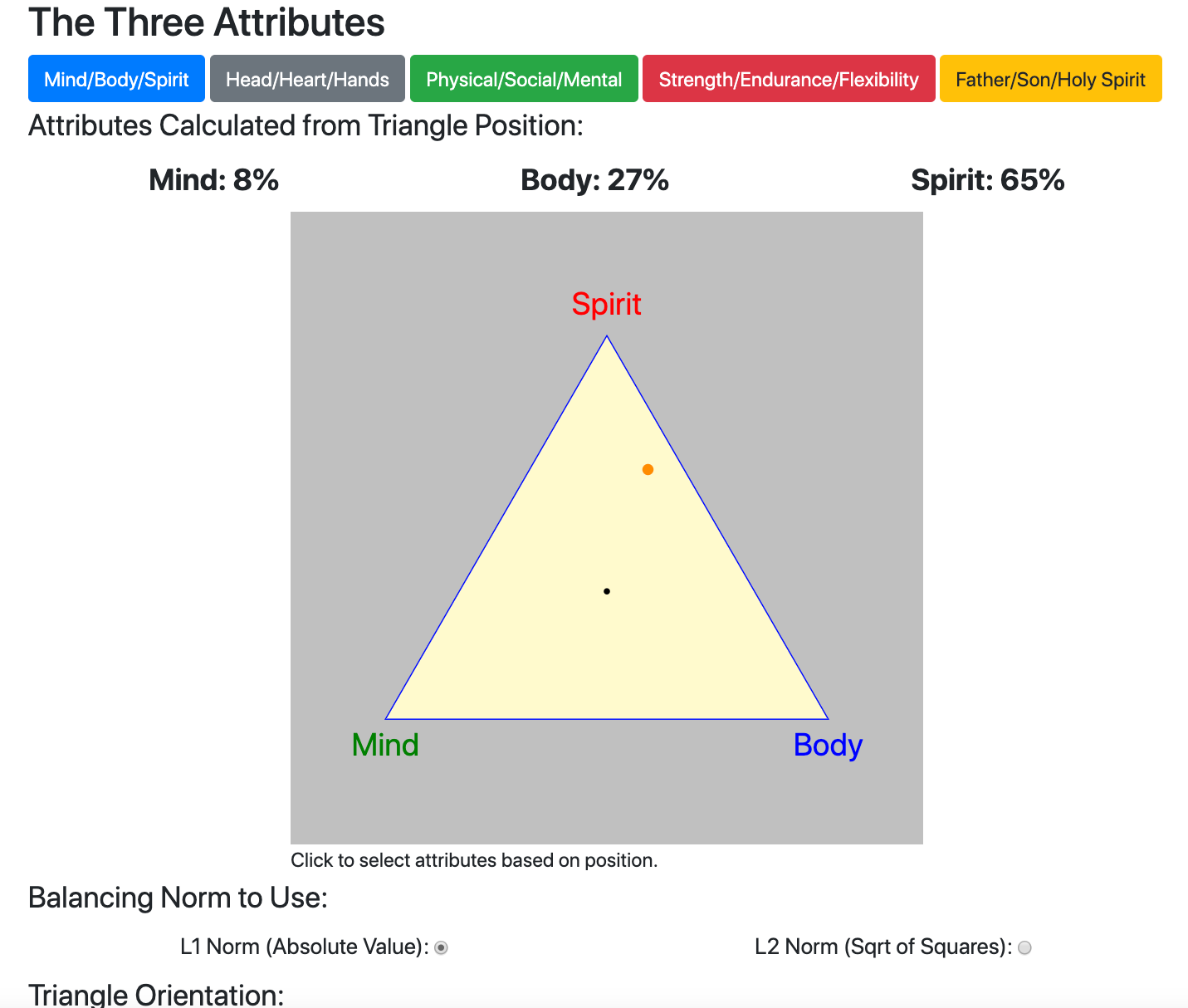
The Triad Balance Diagram is a diagram and a set of algorithms that accomplishes this. Any point corresponds to a “balance” between the three attributes that is represented by three numbers that are in balance: they always sum to unity, or 100%. The central dot is perfectly in balance. A point on the triangle edge between Mind and Spirit has Body number of 0.
Goals of the Triad Project
The most important thing about this mapping from the two-dimensional “diagram space” to the three-dimensional “number space” or “vector space” is that it be intuitive. The second most important thing is that it be “invertible”. That is, a point on the diagram must turn into three numbers that can be stored in a database, and there must be an easy way to get back to the point on the diagram based on those three numbers. That way, one could record there attributes every month for a year and then at the end of year draw 12 dots on the diagram, showing how balance or imbalance changed over the year.
Public Invention, a non-profit, has released an open-source (GPL) implementation of the Triad Balance Diagram as an NPM package and a GitHub repo with an interactive page for you to explore. It is more fun to click through and play with it, but it looks like this:

The project is heavily documented, and should be usable as-is by a JavaScript programmer. It provides a lot of JavaScript customization opportunities, as well as CSS styling.
However, it would be even easier to use if it were made part of common GUI design libraries. We hope that a skilled front-end programmer will make that happen based on this code and the ideas behind it. I am not really a designer, so I don’t feel quite competent to do that, but will happily support any programmer who is trying to integrate this code into a design toolkit.

